
How To Use EPA AirNow: A Complete Guide To Checking Your Air Quality
July 30, 2026
By Michelle Wan, Brand Manager and Air Quality Writer. Technically reviewed by David Clark, Licensed HVAC Technician. Published July 30, 2026. Updated July 30, 2026.
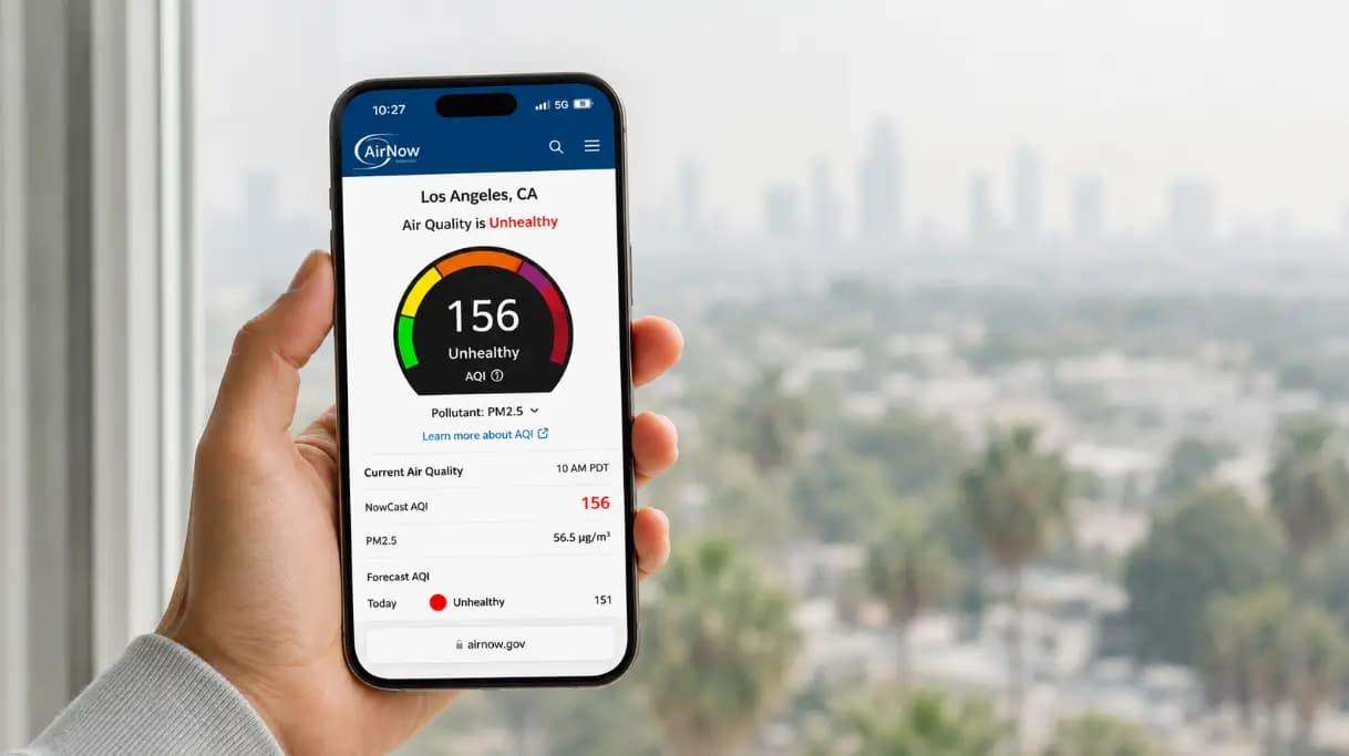
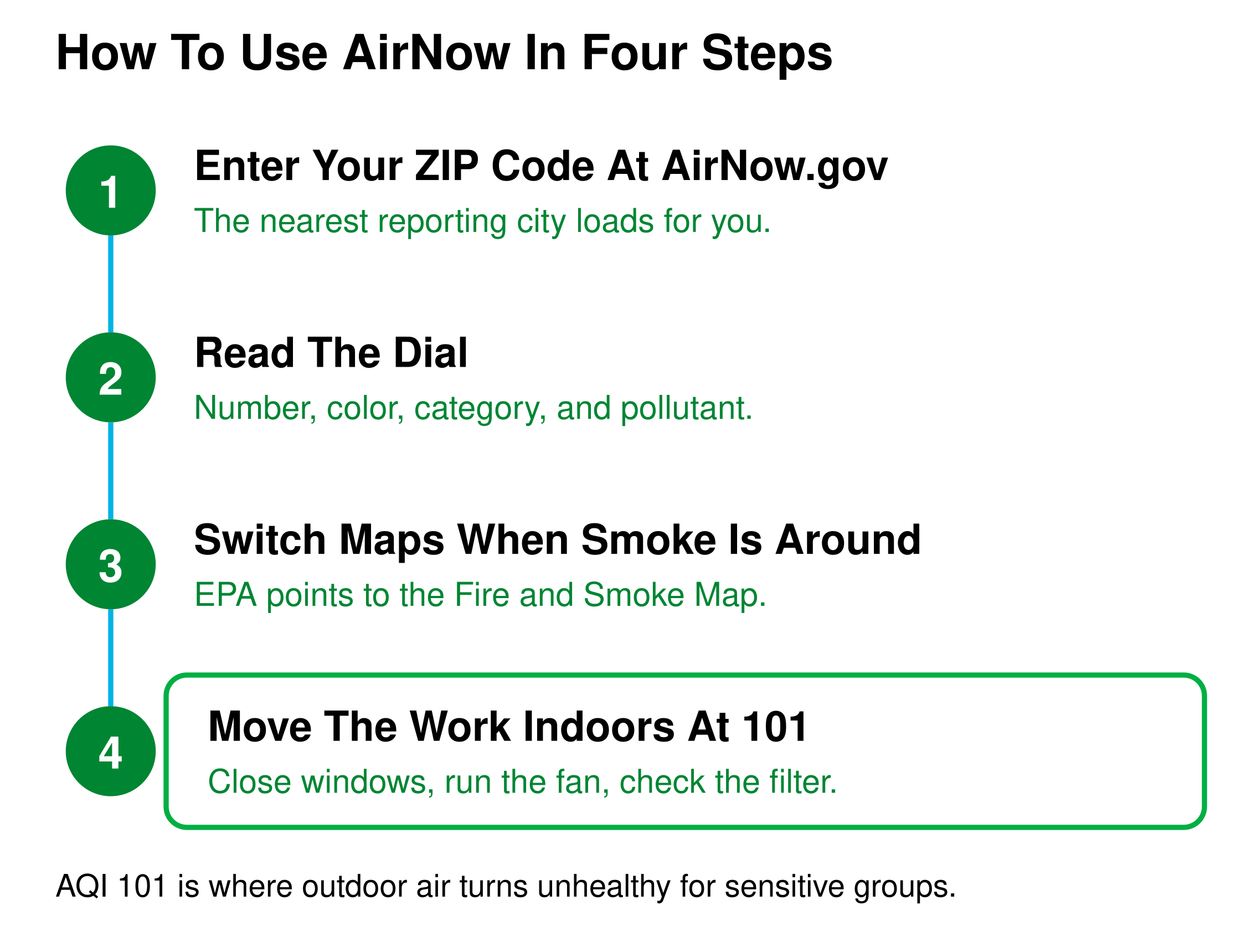
Open AirNow.gov, enter your ZIP code, and read the color-coded AQI number on the dial. The dial gives you the current hour, the category, and the pollutant driving the reading. EPA points you to the Fire and Smoke Map instead whenever wildfire smoke sits in your area. Once the number passes 101, the useful work moves inside your house.
Four steps take you from a ZIP code to a decision about your own air.
Answer three quick questions and we will match you to the right filter size and MERV rating.
TL;DR
EPA AirNow is the U.S. government's official source for real-time outdoor air quality. Enter your ZIP code at AirNow.gov for a color-coded AQI number, a forecast, and maps of where the pollution sits. Use the Fire and Smoke Map instead of the dial whenever smoke is in your air.
Key Takeaways
AirNow reports outdoor air quality on the U.S. Air Quality Index, a 0 to 500 scale with six color-coded categories from green at Good to maroon at Hazardous.
EPA recommends the Fire and Smoke Map over the dial during smoke events, because it reports PM2.5 and adds fire locations and plumes.
Regulatory monitors do not cover the country evenly, so if no reporting city sits within 50 miles of you, AirNow shows a state page instead of a local reading.
An AQI of 101 is where outdoor air turns unhealthy for sensitive groups, meaning children, older adults, and people with asthma, COPD, or heart disease.
What EPA AirNow Is And Who Runs It
AirNow is the U.S. Environmental Protection Agency's public website and app for outdoor air quality. EPA runs it with NOAA, the National Park Service, NASA, the CDC, the U.S. Forest Service, and the State Department. State, local, and tribal agencies send hourly monitor readings, which AirNow converts into the U.S. Air Quality Index.
EPA has published a national index since 1976, covering five Clean Air Act pollutants, meaning ozone, particle pollution, carbon monoxide, nitrogen dioxide, and sulfur dioxide.
At Filterbuy we build pleated filters in plants we own and publish maintained air quality pages for cities across the country, so AirNow is a tool our team works in year round. The thing that pushed us to write this guide is structural rather than technical. AirNow explains itself across five separate pages and two PDFs, so most people assemble the answer themselves and miss the parts that matter most.
For the underlying math, our guide to how the AQI scale is built covers the breakpoints.
How To Check Your Local Air Quality On AirNow
Checking your air quality on AirNow takes under a minute. Open AirNow.gov, enter your ZIP code or city, and the site loads the nearest reporting area with active monitoring data. The dial at the top gives you a number, a color, a category, and the pollutant responsible.
The Five Steps
1. Open AirNow.gov. First-time visitors land on an entry page, not a city page.
2. Click the locator icon, or type a ZIP code, city, or state into the search box.
3. A ZIP code or city loads the nearest city that reports data.
4. Read the dial for the current hour. The color matters more than the exact number.
5. Scroll below the dial for the forecast, the other pollutants in your area, and a small map of how far the current colors extend.
Beyond AirNow, see how to check outdoor air quality today.
How To Read The AirNow Dial And The AQI Colors
The AirNow dial reports four things at once, meaning the NowCast AQI number, its color and category, the hour of the last update, and the primary pollutant. The primary pollutant is whichever pollutant registered the highest AQI across your area's monitors that hour.
Three buttons near the dial do the useful work. Monitors Near Me opens the Interactive Map zoomed to you. Recent Trends charts the NowCast AQI hour by hour since midnight.
Recent Trends is the most underused control on the page. Ozone peaks on hot, sunny afternoons and eases off by evening, so a day forecast as unhealthy often still holds clean hours, and EPA says as much. Check the hourly curve before you plan a run.
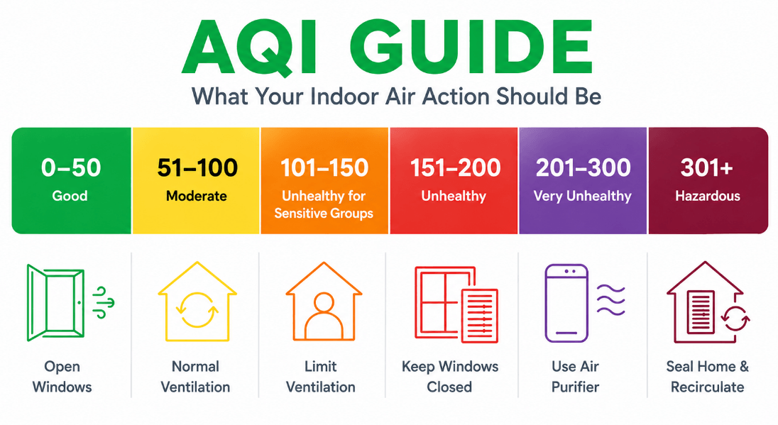
The Six AQI Categories
Ranges and category names follow the U.S. Air Quality Index. Readings above 500 are calculated within the Hazardous category under EPA reporting guidance updated May 2026.
One detail Filterbuy corrected while building this table. EPA's May 2026 reporting guidance calculates readings above 500 inside the Hazardous category, which is why the top row reads 301 and higher rather than 301 to 500. Most published charts still show the older form, because they were written against the 2024 revision.
For the practical version, see what a Hazardous reading means, or check the AQI near you for a live number.
Which AirNow Map To Use, And When
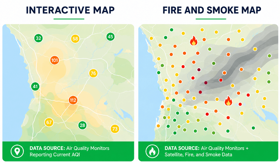
AirNow is not one tool. It is six surfaces, and picking the wrong one is the most common mistake people make. AirNow publishes no comparison of them, so Filterbuy built one by working through each surface and recording which sensor network feeds it.
EPA recommends the Fire and Smoke Map over the dial whenever wildfire smoke is affecting your area.
The Fire and Smoke Map also shows whether your air is improving or worsening, marks fires, and draws smoke plumes. Our walkthrough on how to read a wildfire smoke map covers the icons, and how to read an air quality forecast covers the multi-day panel.
Why Your AirNow Number Disagrees With Your Weather App
Three mechanics explain nearly every disagreement between AirNow and another source. EPA documents each of them somewhere on its site and never puts them together, which is where the confusion lives. This section is Filterbuy's synthesis rather than a restatement.
Reason One: The NowCast Averages Several Hours
The NowCast AQI is not a raw reading. EPA calculates it from several hours of past data weighted toward the most recent hour, which keeps the number stable but makes it lag a fast-moving plume.
Reason Two: The Dial Reports The Worst Pollutant, Not Your Pollutant
The dial displays the pollutant with the highest AQI in your area that hour. On a smoky day with hot afternoon sun, ozone can outrank PM2.5 and take over the dial, hiding how much smoke you are breathing.
Reason Three: The Two Maps Use Different Networks
The Interactive Map and the dial rely on permanent regulatory monitors. The Fire and Smoke Map adds temporary monitors and thousands of crowdsourced sensors, so the two disagree by design. Broader causes sit in why your air quality is bad today.
What To Do When No Monitor Is Near You
AirNow depends on regulatory monitors, and those do not cover the country evenly. Metropolitan areas above 350,000 people are required to report the AQI daily, so large cities always have data while rural areas often do not. If no city within 50 miles of you reports air quality, AirNow sends you to a state page rather than a local reading.
Two moves help. The Fire and Smoke Map adds thousands of low-cost sensors and usually has something closer to you than the regulatory network. Or use the Interactive Map contour layer, which estimates conditions between monitors, and switch on the monitor layer to see which readings feed the estimate. A contour is an interpolation, not a measurement, so treat it as a rough read.
What To Do Inside Your Home When The AQI Climbs
An AirNow reading measures outdoor air, and outdoor air does not stay outside. Fine particles enter through windows, doors, envelope gaps, and your HVAC system, so a red day on the dial becomes an indoor problem within hours. Once your reading passes 100, the useful work happens inside the house.
Close windows and exterior doors until the reading returns to yellow or green.
Run your HVAC on the fan setting so air keeps cycling through the filter. Auto is not enough, because the blower idles between cycles.
Close your fresh-air intake if you have one.
Skip candles, gas stoves, wood fires, and frying.
Check your filter. High-particle days load a filter far faster than usual.
A disclosure before the filter part. Filterbuy manufactures the filters this section points to, so weigh the recommendation against that. The MERV 13 guidance is not ours. It comes from EPA and the California Air Resources Board, and it holds whether you buy from us or not.
Federal and state agencies point to MERV 13 for smoke, because that rating captures fine particles lighter filters pass. Our comparison of which MERV rating matches today's reading covers MERV 8 against 11 and 13, and how often to change your filter during a bad-air stretch covers timing. Confirm your system tolerates a higher rating first.
After manufacturing filters for over a decade and serving more than two million households, we have learned that the number on AirNow is only half the decision. The other half happens inside your house, in the hour after you close the windows and put a clean filter to work on the air your family actually breathes.
— David Heacock, Founder and CEO, Filterbuy
Our MERV 13 pleated filters ship in more than 600 sizes.
Essential Resources
The Filterbuy team leans on these sources for authoritative answers on air quality. Every one comes from a government agency or a national health organization.
1. The AirNow team's walkthrough of the entry page, the dial, the buttons around it, and where each map lives in the navigation. The most detailed first-party reference available.
Source: How To Use The AirNow Website
2. EPA training material written for clinicians, with the AQI category table and the specific activity guidance recommended at each level.
Source: Patient Exposure And The Air Quality Index
3. CDC guidance on reducing smoke exposure, including who needs to be most careful and what symptoms warrant a call to a provider.
Source: Safety Guidelines: Wildfires And Wildfire Smoke
4. The American Lung Association explains the index in plain language and lists the groups at elevated risk beyond the standard sensitive categories.
Source: Air Quality Index
5. The Asthma and Allergy Foundation of America covers how ozone and particle pollution trigger symptoms and what AQI levels warrant a change in medication or activity.
Source: Air Pollution And Asthma
6. A federal overview of every AirNow product, including the API and the archival data sources, written for people who want the data rather than the dial.
Source: AirNow: Air Quality Index Monitoring And Forecasts
7. The California Air Resources Board publishes practical filtration and clean-air-space guidance, including HVAC settings during a smoke event.
Source: Smoke Ready California
Supporting Statistics
People spend approximately 90 percent of their time indoors, and studies of about a dozen common organic pollutants found levels 2 to 5 times higher inside homes than outside.
Source: U.S. Consumer Product Safety Commission, The Inside Story: A Guide to Indoor Air Quality
Respiratory hospitalizations rose between 1.3 percent and 10 percent for each 10 micrograms per cubic meter increase in wildfire-specific PM2.5, compared with 0.67 percent to 1.3 percent for PM2.5 from other sources.
Source: Aguilera et al., Nature Communications, 2021 (PMC7935892) Aguilera et al., Nature Communications, 2021 (PMC7935892)
AirNow reports current conditions and next-day forecasts for more than 400 cities and maintains hourly maps covering 46 states and part of Canada.
Source: U.S. Climate Resilience Toolkit U.S. Climate Resilience Toolkit
Frequently Asked Questions
Glossary
AQI (Air Quality Index): EPA's 0 to 500 scale for outdoor air quality, in six color-coded categories from Good through Hazardous.
NowCast AQI: The current-hour AQI on AirNow, calculated from several hours of data weighted toward the most recent reading.
Primary Pollutant: The pollutant with the highest AQI among monitors in your area that hour. AirNow shows it on the dial.
PM2.5: Fine particulate matter 2.5 micrometers or smaller, the dominant pollutant in wildfire smoke and the one the Fire and Smoke Map tracks. See what PM2.5 actually is.
Ground-Level Ozone: Formed when sunlight reacts with vehicle and industrial emissions. It peaks on hot, sunny afternoons.
Fire And Smoke Map: The AirNow map EPA produces with the U.S. Forest Service, showing PM2.5, fires, smoke plumes, and trend direction.
Sensitive Groups: The populations EPA identifies as affected at lower pollution levels, including children, older adults, and people with asthma, COPD, or heart disease.
Contour: A shaded area on the Interactive Map estimating air quality between monitors, interpolated from surrounding readings rather than measured.
MERV: Minimum Efficiency Reporting Value, rating how well an HVAC filter captures particles from 0.3 to 10 microns.